We are a tad embarrassed to admit that this is the third mark in our 15 years of existence, and even more embarrassed to admit that our most recent mark only lasted a mere year.
Here’s the story:
Venture back to 2002 when Luma was born. Our Founder, Payam, thought the word “Luma” had a nice ring to it. The original mark was meant to be organic and custom, with the handwritten letters speaking to our artistic nature. We create art, so it all made sense.
![]()
Fast forward to 2015.
This was the start of bigger things for Luma. We achieved some key hires in the company, and started to give a f*** about marketing. That meant it was time to develop our brand, which called for a new and improved mark.
In the same year, we launched our animated content division, a tech venture fund, and started to dabble in the creation of our own original content. We were experimenting; we were evolving. Thus, the version you see below was born. Is there an amazing story behind it? No, but we liked the look of it.
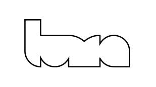
Over the course of the year, we started to expand beyond our roots in visual effects. Luma had become a group of creatives creating great IP, and you could even say we were becoming our own client. We were itching for a mark that truly encompassed our story and celebrated our evolution.
Ladies and gents, Luma’s mark!
![]()
It celebrates the artist’s touch, capturing the rhythm and playfulness of a continuous gestural line. Acting as a signature, this logotype imparts an original and lasting impression on the work it superimposes. The result is a custom flow of letters, each different, that come together in a cohesive way just as all facets of Luma have come together to form the Luma of today. It’s organic. It’s sort of tough to read. It’s our signature. It’s Luma.